39m
Skillshare
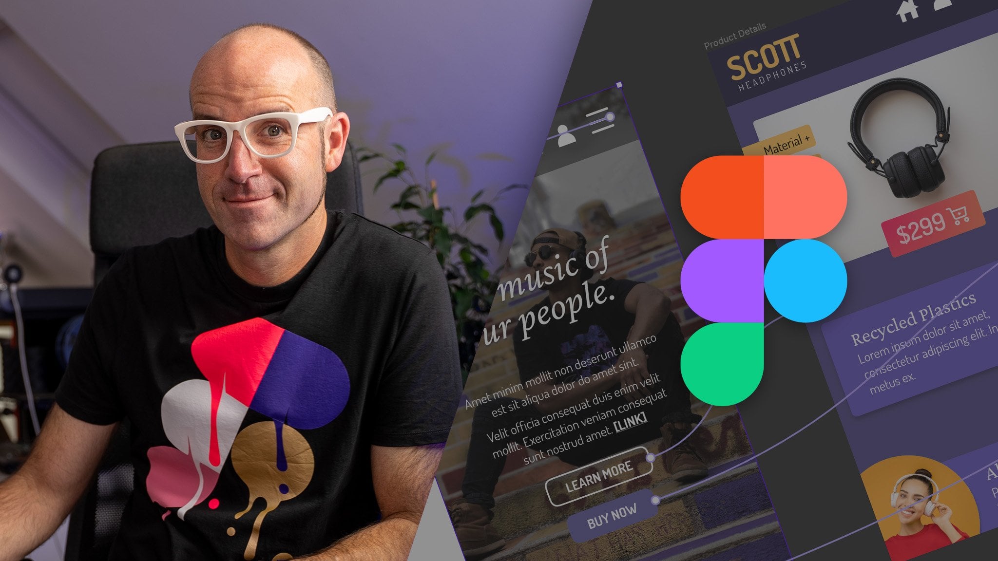
Figma: create Responsive designs!
39 minutes
In this short course (30min) you will learn how to create responsive designs with Figma. You will understand the concepts behind Constrains and Autolayout to create a simple landing page that behaves responsively. Applying this methods you will be able to adapt your designs in seconds instead of hou...
BeginnerSelf Paced
SubscriptionView course