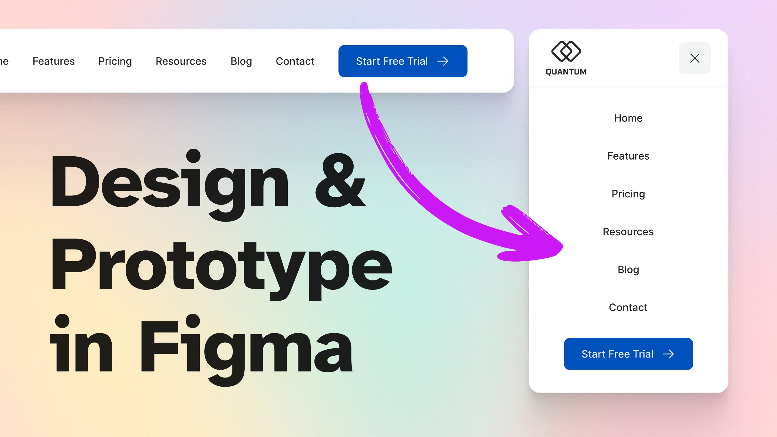
In this class, we’ll design and prototype a responsive website header in Figma — the kind you see on real-world sites, with clean navigation, a strong brand presence, and a clear call-to-action.
We’ll cover:
- Key principles for effective headers (with real examples)
- Structuring your header for all screen sizes
- Using Auto Layout for easy responsiveness
- Adding a smart CTA button (built with the component from one of my previous classes)
- Prototyping the mobile menu with Figma Make so it’s fully interactive
If you’d like to learn how to create that button from scratch, check out: How to Create a Smart, Reusable Button in Figma (with Variants & Properties) — it’s the perfect companion to this one.
By the end, you’ll have a fully responsive and functional header ready to drop into any project — plus, you’ll know the best practices for making headers that work beautifully across devices.
This class is beginner-friendly, but even if you’ve been using Figma for a while, you’ll pick up tips for working faster and building more flexible layouts.
Let’s jump in and design a header that works everywhere.